The New Pepsi Logo Sucks

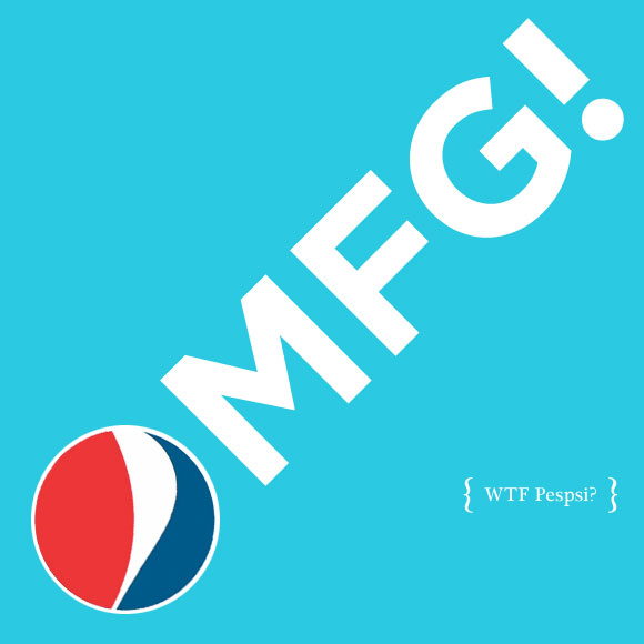
OMFG Pepsi!
Sorry if this is old news, but Pepsi has a lame extremely bland, ungraceful and nauseatingly vile new logo.
While described as a “smile” by Pepsi’s brand managers, to me the new logo looks like a muffin top. Pepsi’s old logo was at least stable and bold. The new one looks like a brain damaged designer on a short bus just randomly tweaked vertices. And there are three variations of this crap: little muffin top for Diet Pepsi, normal muffin top for regular, and big muffin for Max.
Looking at these logos on various blogs was bad enough, but when I came back to the States for the holidays many of the grocery stores were stocking the new packaging. There is something sinister in the shade of navy blue they chose for the cans and boxes. It almost looks like 2 liter bottles of NyQuil. The brown, 20 oz. bottles look like wrinkly dicks. The Pepsi logotype has a maddening “e” that ever so subtly references the old pepsi swirl.
The advertising introducing the new logo is eye-rolling. Outdoor ads plaster Dallas. Various optimistic words using the new logo as an “o” are set on a variety of flat vibrant backgrounds colors. HELLO, SODY POP, JOY, HOORAY, OH BOY!, ETC. You can get the general idea from the video at Pepsi’s Refresh Everything site. If these ads were in a student book of someone interviewing at an ad agency, I guarantee they would be laughed out the door. Instead, they are a campaign.
I’m all for change, but I wish Pepsi would have deliberated for more than 5 months before throwing out one of the few internationally recognized logos and instituted a worse version for hundreds of millions of dollars. Until the new logo gains traction, it appears like a knockoff. This is Chinese Pepso, or Cambodian Popsi, or Brazilian Pepsé. I shudder to think of all the table coverings, umbrellas, posters and signs that I saw for this swill in Thailand that will eventually replaced (and dumped) for this new logo.
Apparently, the new logo is the work of Arnell Group. If you like/dislike what you see, be sure to let them know.
There’s also been plenty of heated discussion, mostly negative, over the new Pepsi logo at Brand New.
Don’t get me started on the botched redesigns of Tropicana, Gatorade, Mountain Dew, and Sierra Mist.
Sigh.

